Government Agency UI Redesign Case Study

By Mark Markovich

Capture.JPG

Project Description: Redesigned The Department of Energy website to make it more effective as a user resource.

Tools: Figma.

Timeline: Four Weeks

Disclaimer: This case study was intended as an academic exercise only.

  1. Project Overview

  2. User Interface Analysis

  3. Information Architecture

  4. Responsive Design

  5. Interaction Design


Project Overview

THE PROBLEM: Energy.gov, the official website of The Department of Energy, contains a wide range of disparate data. The intended audience is not clear and the site’s Information Architecture is difficult to navigate. On top of that there are several glaring usability issues.  

THE SOLUTION: Determine who the intended users are and restructure the IA to accommodate their needs. Rebuild the aesthetic of the site be more consistent and eye pleasing while also meeting usability standards. 

MY ROLE: UX Researcher. UI Designer.

TOOLS: Figma

TIMELINE: 4 Weeks

Note: This project was done as an academic exercise only and is not associated with the Department of Energy in any way.


User Interface Analysis

Proto Persona

What kind of person visits energy.gov and why? Enter Duncan, a fictional user that I created to better understand the the strengths and weaknesses of the site.

Proto Per

Duncan has been seeing his gas and electric bills spike dramatically, especially in the colder months of the year. He hates to pay more than he needs to especially if he doesn’t know why.

He heads to energy.gov in hopes of finding some answers. Is the cost of energy going up? Or is he not using his energy efficiently? If so, how does he go about getting an audit.


User Interface Analysis

User Path

1. From the homepage he would select Save Energy, Save Money from the navigation bar.

2. From here he would scroll down and under the Weatherize section he would click on Air Sealing

3. Finally he would land on the Air Sealing page, finding the information he needed.


User Interface Analysis

Heuristic Review

1. User Control & Freedom

Clicking the Energy.gov bar from any sub page takes you back to the main page. I don’t think this qualifies as the exit being clearly labeled and discoverable, but I would say it is intuitive.

2. Consistency & Standards

While both link to the same page it is referred to as STEM under the Science & Innovation dropdown and  Science Education at the footer.

3. Consistency & Standards

This black navigation bar is so stylistically removed from the rest of the site. It contains Social Media links but also links to the DOE’s offices and their National Labs, which all seem tangentially connected at best.

4. Match Between System & Real World

This icon is too small and unique to be clearly associated with a real world counterpart. It is also only ever used here and other nav drops don’t have icons.


User Interface Analysis

Accessibility Review

1. Contrast

The color of the text of Energy.gov does not contrast enough with the color beneath it. This fails on all ratings.

2. Text Alternatives for Non-Text Content

The Energy.gov logo and title do not have alternative text and will not show up on devices for vision impaired users.

3. Form Field Label

The Search feature is only identified with an icon. With no label or alt present assistive technologies may not render it correctly or at all.

4. Links Not Indicated. 

Article titles don’t indicate clickability. No iconography or explanation is in place. Hovering activates an underline but that is not present in mobile.


User Interface Analysis

Navigation Heuristic Evaluation

1. Usable

The navigational titles are vague and don’t guide the user. Sub sections like STEM, also called Science Education elsewhere on the site, are robust enough to be considered their own categories.

2. Learnable

Many sections contain pages for a range of user goals and aren’t grouped intuitively. The Save Energy section is for citizens to learn about energy efficiency but it is not grouped with the Vehicles page, which has  efficiency tools for citizens to use.

3. Findable 

The About, Offices and National Labs seem to be core to the DOE but the links are placed in this black nav bar that is easily overlooked. They are grouped with Social Media for reasons unknown.

4. Clear

Save Energy, Save Money is the only item on the nav bar with an icon. This is inconsistent and confusing.


User Interface Analysis

User Research & Testing

User Research and Testing.JPG

The Department of Energy has a broad purview. This can be a strength because it brings users to the site for a wide range of reasons. It can also be a weakness when trying to create a clear user flow that serves many masters. The goal of the user research was to see how this affected navigation when applied practically. 

I conducted five user tests that asked each user to perform a number of navigational tasks on energy.gov. In addition to the tasks I also collected their general impressions about the effectiveness the site as well as it’s aesthetic value.

Key Takeaways

  • Two users didn't know that STEM was synonymous with Science Education, causing them to miss a quick navigational solution.

  • Two users noted that the Offices link in the black bar at the top of the site didn't seem to be part of the site. One user missed that connection entirely and was not able to complete the task.

  • One user noticed that the universal Contact Us link at the footer reroutes to the top of the home page. This error prevents users from contacting the Department of Energy.


User Interface Analysis

Navigation Usability Testing

After reviewing the navigational user tests from the previous assignment, as well as those of my teammates, I identified some common problems users had. 

  • The purpose of the site, and the administration itself, was not clear.


  • The page categories were confusing and made it hard to find the information they wanted. 


  • Individual pages seemed focused on specific user types but they were all shuffled together making the focus of the site unclear. Was this for citizens, energy professionals,  public employees, etc?


  • Users would often get lost on the site and give up on the task.

 
JohnnyQuote.JPG

One of my testers, John, works in the energy industry and has actually used the site in the past. He said that he will search for what he needs on the domain via Google rather than through the site’s internal navigation and search function. 

The site does have a lot of good information but finding it is a chore. So how could I fix this?


Information Architecture

Card Sorting

  • After reviewing energy.gov and the user tests I made a list of the most visible pages and  broke them down into about 60 cards in Figma. 

  • I sorted the cards into like groups. With a few exceptions most of the cards seemed to clearly fit into categories of Administration, Industry, Business, and Homeowner/Consumer.

Card SortISO.JPG


Information Architecture

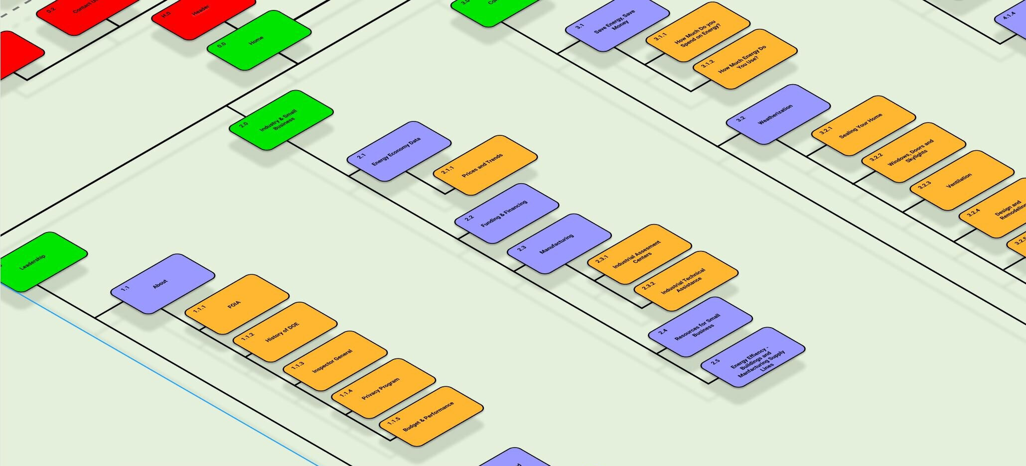
New Site Map Design

  • Using the existing cards from the sorting exercise I arranged them based on category and hierarchy.  


  • I color coded each card to clarify their roles as primary, secondary, tertiary or universal elements. 


  • Each card is numerically labeled so their place in the overall structure is clear.

Site MapISO.JPG


Responsive Design

Wireframes

Building off of the Site Map I had in place I created three new wireframes for the site’s home page. To visualize responsive design I built out versions for desktop, mobile and iPad with clickable features. 

wireframes.JPG


Responsive Design

5 Second User Tests

I conducted two 5 Second Users tests with my colleagues. Based on their feedback I iterated the following changes. 

  • Made the search field easier to notice by adding color to the stroke.

  • Brought the separation lines in from the bleed so they adhered to the margins and lent to a more balanced look for the page as a whole.

  • Widened the News items from square to rectangular to make them more similar to the Priority items while still keeping them different enough to convey hierarchy.


Responsive Design

Creating Visual Style

After creating a clickable low-fi wireframe I went about applying a visual style that conveyed a hierarchy to lead the user through the site.

I opted for an understated color scheme with limited components and a uniform typeface family.

StyleTile.JPG


Responsive Design

Applying Visual Style

Next I applied the visual style that I decided on to the mobile, iPad and desktop versions. 


Interaction Design

UI Style Guide

Capture5.JPG

With the homepage redesign complete I knew the next step would be to broaden the scope of the project by including more sub pages. More pages meant more components to create. 

Keeping all these components consistent was beyond the scope of the Style Tile I created earlier. I expanded that document into a nine page Style Guide.

In addition to the new components the guide also lists color, typeface and graphic elements. In many cases it details the correct (and incorrect) way to use them.

Click her to view the full Style Guide PDF.


Interaction Design

Expanding Mobile & Desktop Prototypes

To give a fuller sense of what the navigation experience would be like for the average visitor I expanded on the home page by adding the following:

  • A Contact Us modal

  • A Search Results aggregate page.

  • A page focused on Weatherization.

To illustrate the Responsive Web Design I applied this expansion to both the Desktop and Mobile versions of the site.


Interaction Design

Usability Tests

Capture3.JPG

Once again I subjected this iteration of the site to user tests. I tested the mobile version with three people with varying backgrounds.  

For the most part the tests were successful but there were some problematic areas that were common to each tester.

Key Suggestions

  • Make all buttons one click only

  • Remove mail icons

  • Add Main Page navigation to the menu options. 

  • Make the contact form a page instead of a modal. 

  • Make the homepage’s hierarchical identity clearer through descriptive text.


Interaction Design

Final Iteration & Next Steps

After iterating the final changes based on the last round testing my work on this exercise was complete. I feel that I successfully took a site with unfocused information architecture and restructured it to better serve it’s intended users. I’m also happy with the updated style and the site’s enhanced accessibility. 

If I continued iterating on this project I would focus my user testing to examine the effectiveness of my site map. I would also expand on site to include more components from my style guide. 

Thank you for your time. 

~Mark Markovich